Posted on 1 Comment

The meaning in art. “Social distancing” a painting.

Social distancing

Looking at a piece of Art, everybody wonders what prompted the artist to execute the work. Unfortunately, too often, there is no other explanation than commercial.

For most of us, Art is a physical piece with a dollar value assigned. Too often, the dollar value is the most exciting aspect of the otherwise dull work.  

To be clear would like to explain the origin of the word.

Since “Art “for centuries was an expression of Meaning, meaning is the ultimate purpose of creative work. It expresses something. It tells the story and uplifts the spirit.

Contemporary Art often communicates the confusion and lack of purpose in an artist’s life. We all strive to have a meaningful life, but some of us replace the image of God with the dollar sign. No wonder Warhol did not bother with producing Art painting dollar signs; instead, when the Art is a substitute for a banknote.

As famous art critic Panofsky said, viewers receive only answers they are able to ask.

That’s why we are staring at old paintings in museums without a clue. The world of the spiritual life of our ancestors is gone.  We, the Huns, the primitives, are left behind without the key to unlocking the treasures. 

Our substitutes are weak and confusing, and the Art is mostly not up to the task of expressing the human problems of our times. Again you can compare the modern and the old sections of any museum to see the number of viewers.

Yet the need to express the spirit of our time exists. A few artists are trying to reach beyond the paint’s surface and convey a thought. Still, they are nonexistent in official art institutions, preferring sanitized and meaningless — prescribed noncontroversial work. 19-century academy made a 180-degree adjustment and exists now under the name of institutionalized “AVANTGARDE.” So AVANTGARDE is DEAD.

Let’s ignore the official and try to see the meaning of Art. Contemporary Art.

Any artist paying attention to the world beyond studio walls is trying to visualize reality. This simple task is often most challenging since the limit is the ‘imagination.” This particular skill is not in plentiful supply even among people calling themselves artists. That is why we have an endless supply of secondary works following or copying any artists with some financial success. Art by prescription dominates the landscape.

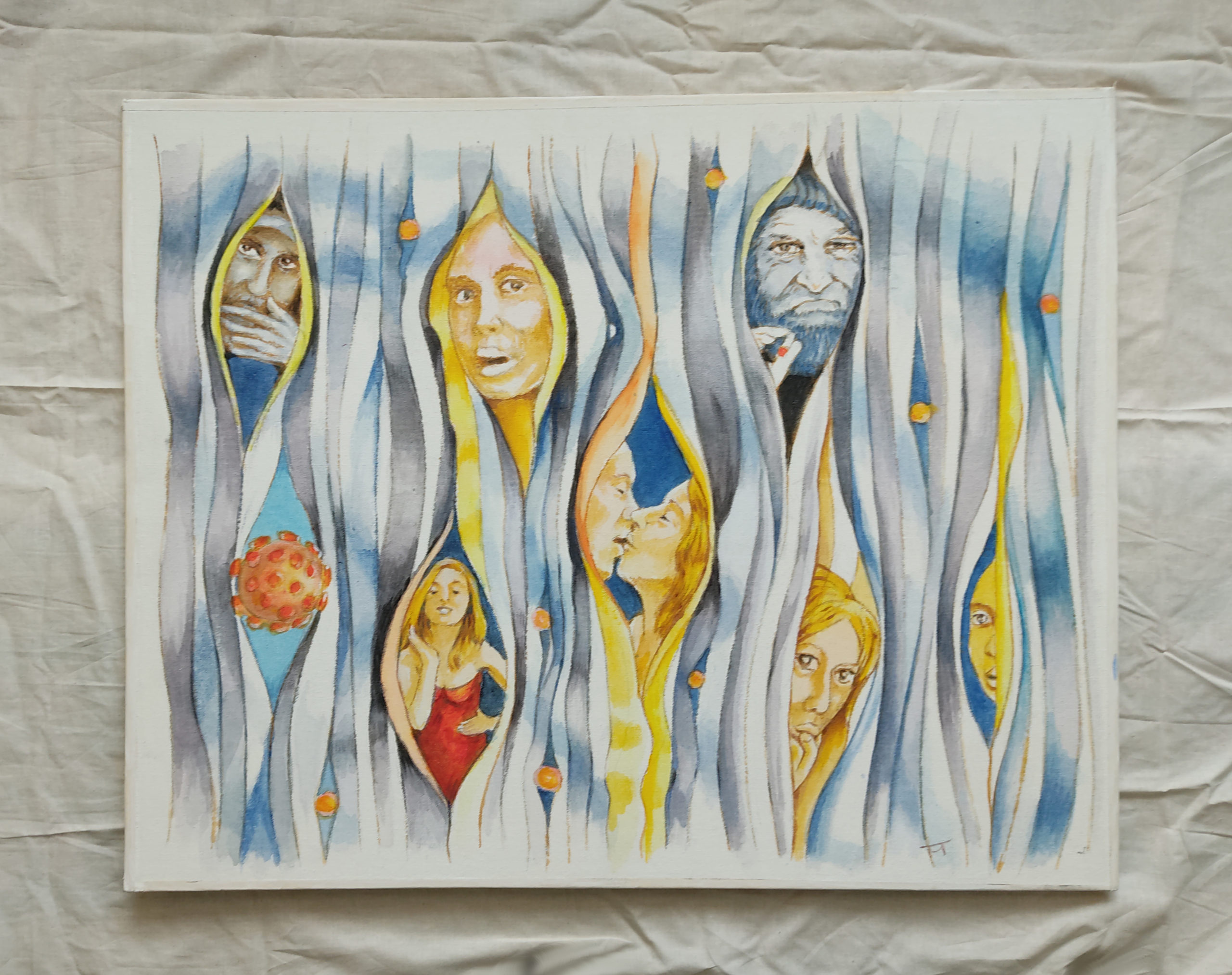
Below you can see a painting: “Social Distancing” 2021 piece graphically expresses the most crucial aspect of the time. The painting conveys the time of our lives unusually and attractively. It sticks out by itself, and no further comment is necessary. There is no question about originality of the work, or the skills of the artist. The sign of real art.

Many have no trouble picturing ourselves in this painting with degrees of separation.

Social Distancing

Acrylic on canvas 24″h x30″ wide. Canvas is attached to a light corrugated plastic panel. There is no need to cut a tree.

A cord is attached to the back of the panel to help with hanging. No frame is necessary.

The artist? Jacek Maria

Social Distancing

Posted on

The Other Art Fair. 2021 Art Fair by Saatchi Art.

The Other Art Fair by Saatchi Art. “Dead Wood.” This is my impression after viewing the show assembled in Chicago in 2021. “Dead Wood” is a crowd of nice people, a bunch of images on the walls, and the overwhelming feeling of going through a furniture warehouse without the feelings the Great Art here and there is supposed to bring out. I found a trinket in the form of art books by Alexander, but not great images evoking any feeling in my heart.

There is no question I will forget them all once I walk out of this stable of ready and willing artists. SAD Feeling.

You may ask me what makes GREAT ART.

The answer is simple—the piece which sets your heart alive.

Years ago, I used to live in Prague. The beautiful city at the time under the communist regime, like most cities in Czechoslovakia, was a little bit drab and grey. However, I could easily spot the beautiful great historical buildings and history still present in and among them. Leaving the city, I was trying to take a little bit of the place’s charm with me, so I walked into a local gallery and bought a print showing the town. I found the same print two years later ln Poland, where I was trying to clean my apartment before moving to Rome. The print was so average that I forgot about it. 

A great piece of art has a distinctive personality. It stays with you, and you never forget about it.

My search for something beautiful in the overwhelming greyness of Czechoslovakia at the time brought out my dissatisfaction with myself for trying to find the “unique”. I was looking for uniqueness in a place it did not exist. I realized that I convinced myself to buy this piece because I was tired of my high aesthetic expectations and could not find anything, so I lowered my expectation to accept the artist and the art I bought.


It would help if you remembered that at the time, like in any other country under a communist regime, the art and the artists present on the market were allowed to exist under the government’s strict control. Art reflects the spirit. Somebody who is not free and accepts ideological control can not create great art. The “Freedom” I am talking about is not the word “free” used in the west. This word has a separate and quite deep meaning. It reflects the deepest beliefs, a combination of honor and patriotism, not the freedom to do silly things. For people who lost it or are on edge, it Is a serious word.

Many of us looking for great art are taking a similar approach.

We lower our expectations to accept

what is ready and available. With the visual onslaught, it is very difficult to find something in the crowd to our satisfaction; The traditional criteria are gone (can you imagine music played by a performer who doesn’t know the instruments)? It is accepted in visual arts (for example, art by Alex Katz), So we get accidental quality performed by unskilled people. If you have any doubts, go to the contemporary art section of any museum and compare the number of present viewers with its historical area.

So where is the GREAT contemporary ART? It would be best if you learned to recognize it using traditional tools of logic, common sense, quality, and great visual appeal. Look into your heart, not in the market values.


I did not visit the “Other Art Fair” in 2022.

Posted on

Always traditional Highly Polished meaningless Religious ART

the Meaning of Sacrifice

The National Gallery of Art in Washington, DC, among others, shows some great religious art examples. You can spend hours and be always impressed by each next piece there. Simultaneously, looking for an example of great art in churches in the U.S., you see only an ersatz of art. Disappointment, to be exact. There is no original art. Pieces are ordered from a catalog. The art is not first-class; rather, it is no class following centuries-old recipes and without any live aesthetical impact. Frozen in the past and the fear of the creators of the subject. There is a lack of intellectual ability to develop new interpretations—the same disease as in contemporary art. Same time many US-based artists are taking on the subject. For example, I saw crosses painted by Roger Brown Chicago and quite a few samples created by other artists.
Located near Pittsburg, PA, every 2 years, St Vincent college organizes a “Religious Art Competition” started by now-deceased brother Nathan as his project to attract several artists. Since no art trying to be relevant can avoid the universal subject of human suffering, I was trying to capture some meaning in my work. And when I learned about an opportunity to show it and was faced with the task of packing and shipping instead, I jumped into my car and drove 550 miles overnight from Chicago to deliver my oversized piece. Of course, I enjoy such trips to see new places and people with the taste of an adventure.

I noticed this and a few other times that the choice of “wining” artworks were related not to the criteria like the ability to interpret the subject or even technical and artistical quality but, most of all, to the juror’s background and upbringing. Simply the personal preferences of a juror who preferred primitive art shunning other much better technically and artistically pieces, plus a case of a person who was brainwashed during her study to prefer nonrepresentational art.
Religious art is unavoidable about the subject, and an unarticulated piece of twisted metal that received one of the commendations was not expressing anything about the subject.
The juror felt under pressure to recognize what is currently in fashion—a piece of dead junk.
I appreciate people taking on religious subjects regardless of current trends.
They do it regardless of dead prospects, just because of the love of the subject.

But there is too much religious fear freezing artists’ hands to expect fresh new interpretations.
The artist’s educational, and cultural background is one more limiting factor pushing some of us to, for example, toward dark backgrounds.
In Chicago, you may see first (and online 2020 ) a small exhibition of religious art. The outcome of a Religious art competition 2020 organized by the “Catholic art Institute” https://www.catholicartinstitute.org/competition

A couple of submitted pieces showed a more free/ artistic approach to the subject but were not displayed on the website. What I regret is that we can not see all submitted artwork to see more diversity.
The final selection, in my eyes, is limited to traditional interpretation.
It is a pity that we see only a small fraction of the 400 pieces of submitted art.

Posted on

Fresh Cut Paper? popup cards with no so fresh interpretation

FreshCut Paper Dear Dahlia comes with its very own festive pink vase that allows it to sit on any flat surface. Our paper flower bouquets never wilt, never fade and never lose thier color. More than a greeting card, it's a keepsake for years to come for any recipient. There is a new website on the paper horizon. “FreshcutPaper”
On the first sigh, impressive, nice graphics and designs.
But after 3 seconds, there is also a reflection.
Looking at the subject of the designs, the viewer starts thinking.
I saw it already somewhere.
Of course, it’s the new trend of paper flowers we call among us the “Mee too movement.”
It has nothing to do with the well-known social movement against sexual abuse and sexual harassment.
It is about designers impressed by others who start the same subject.
This time I dare say they follow our Paperbee.net pop-up flowers.
ME too, I too, screams their web pages suddenly featuring a bunch of paper flowers.
I like the subject, and I can do it too.- screams the page.
Can you?
1) The designs are SO BIG. At least 24″(60cm) high. The size alone physically prevents any attempts to have them on display Longer. Small is beautiful. Not BIG.
Who is going to keep it on display, requiring so much space?
There is no certain intimacy we develop with small and beautiful.
2) Stylized Designs are well done, but… It is quite clear that the artist cannot bring his own interpretation of the subject, and that’s why he sticks to realistic renderings.
Lack of creativity and, in my opinion, understanding of the medium shows up when we look at the string of the designs. He is changing flowers but they look all the same. BORING in effect.
God-given spark is not present.

On the positive side. I can congratulate the designer that he is trying to bring his own voice to the growing paper flowers Field.

With so many web site pushing China/Vietnam-made and design pop-ups, his work is a welcomed addition.
Frankly, I am afraid after the initial push; he may not last very long. Small sizes and an interesting variety of interpretations are needed.

The cultural background (US raised) emphasizing repetition (not developing interesting variety) works against the designer. Of course, looking at his website, he totally disagrees with our assessment.

The image has the link to their website.

Posted on

Printed Matter Art Book Fair

Over a year ago (2019) Prompted by my family’s desire to see the newest indie-independent art we went to Chicago’s “Printed Matter Book Fair”. After finding parking on Wabash Ave short stroll brought us to the Michigan location of this glorious event. Old buildings on Michigan Ave destinations by themselves showing to the visitor quite an interesting 19-century approach to architectural design. There is a certain charm preserved in the old interior decoration. A crowd of mostly young people filled the stairs and walkways on 3floors of the building.
Crowded Floors filled with exhibitors and viewers with little space in between on the first sight offered plenty of interesting things to see. But after a while searching for the new, beautiful, and unexpected there was a sort of disappointment. Clearly, we expected more. The first thing which struck my practical mind was a discovery that no independent bookseller present on these 3 floors was offering something I would purchase, read and cherish for at least for a while.

Books exist not only in their physical form but at least to me as the frame for an interesting message. The message was the ingredients missing. The main message emerging from seeing the fair was a message of the author’s loss and confusion. Focusing on form, printed pages without a clear intellectual path produced nothing memorable. Even a few pop-ups I saw, did not bring to me this kind of satisfaction or curiosity to prompt me to purchase one since they are bound to sit on the shelves forgotten because of the sin of not carrying a message.
Message It is the ingredient missing from contemporary US American art. That’s why Manga Books and similar foreign inventions dominate the U.S. market. They bring the message – excitement.
In a culture focused on the financial aspect, simple seeds of imagination and creativity have no chance to flourish. The young generation of makers is trying but since there were born and raised in this environment there are trying, but falling short.
Coming back to my family we came to the conclusion that our time could be better spent.
Unfortunately.
But I think we should keep watching. true art comes unexpectedly and in small portions.
This February 2021 Printed Matter will launch its first Virtual Art Book Fair (PMVABF)
https://pmvabf.org/

Posted on

The quality of your Greeting card goes long way

The Face By Jacek Alfac.us

Have you ever thought about how your greeting card is received?
Is it quickly put away?
You bought run-of-the-mill cards and they are recognized as such by recipients?
Lost opportunity since a better, memorable piece of paper art may keep your name longer on display and bring you either some love or some new business.
It will not cost you a dime more, just some attention to where to spend your hard-earned money and get a better product. There are some significant differences in how cards are received.
3-dimensional cards stay on display While flat greeting cards?
Usually, they disappear quite quickly. Some remain on display for a few days. Especially during the holiday season. After that? Most of us discover flat cards during big cleaning projects; years later tucked away.
3D pop-up cards hold more staying power with some differences.
1) The one in the “book” form requires two hands to open and face a similar fate. They are exposed to the viewer just for the moment. Not a big difference compared with the flat one.
All of them are Almost or let’s say simply IDENTICAL.

Sold, for example, by Lovepop, Hallmark, Americangreetings, Chinese companies on E-bay, and a number of other sellers under different names.
2) and then really original Free-standing cards remaining open on their own, at the TOP of the Pack.
Like Santoro, Paper D’Art, Graphics3inc, or us, Paperbee.net


They stay displayed by the recipients for DAYS., and months to come.
Take it into account when you decide which of the little ambassadors you will employ.

The quality of your card goes long way.

Posted on

Rothko religious art – Chapel of Death

the devil dancing on your grave by DanielWagesSep 22 2014

A few years ago, I learned about a Chapel described as “Catholic” decorated with the art of Rothko. Upon seeing the “art,” it is not hard to conclude that there is something amiss. Huge pieces covered with black paint dominate the space. The symbolistic meaning of the black color is obvious and doesn’t demand an explanation.

Looking for the logic behind it, there is no explanation why any “Catholic” institution would accept art showing black surfaces without any indication about the subject.
Faith, Christ in religious tradition, is a synonym for Light, happiness, and knowledge, not about the night.

Of course, I saw it as dumbness of people to finance this “ART” The explanation of why the canvases are black surfaced quickly after taking into account the painter’s background. There is the view of Christ as a false prophet. Historically, some Jewish writers and scholars have considered Jesus as the most influential “false prophet,” and their traditional views of Jesus have been mostly negative.
Apparently, the painter painted it that way as a “false prophet,” darkness, I think unintentionally taking advantage of the rather dumb sponsors, or maybe he was not creative or wise enough to stay away from his habit of flatly painted plain canvases.

Is his interpretation intentional? This art interpretation is apparently the reason behind why the Chapel is labeled as non-denominational.
I do not think any religion would accept images of deity as a plain black surface. Also, I do not know any priest who would use it.
Regardless of your religion. Would you pray to the piece of black canvas?
Unless you are a SATANIST.
The artist committed suicide a year after painting this “ART,” still displayed in Houston, Texas, since 1971.

In your opinion who or what depicts this “art”?

“Literary historian William E. Cain observed in the Southwest Review that it is said of these canvases that they “are saturated with death; they are representations of the void, stark and remorseless but, somehow, uplifting evocations of emptiness: they absorb us into themselves the longer we gaze at them.”

The top Devils gif image of the devil dancing on your grave
is by DanielWagesSep 22 2014
The bottom GIF Source
clterryart’s Tumblr post